
Styles
Overview
Section titled “Overview”Styles control how dashboards look and how data states are communicated. Use them to keep dashboards consistent across teams and tenants.
How it works
Section titled “How it works”Rokks separates action colors, identity colors, and data-state colors. Users normally choose themes, palettes, and widget options through the UI rather than editing technical settings. Data-state colors should represent meaning such as success, warning, failure, or informational state.
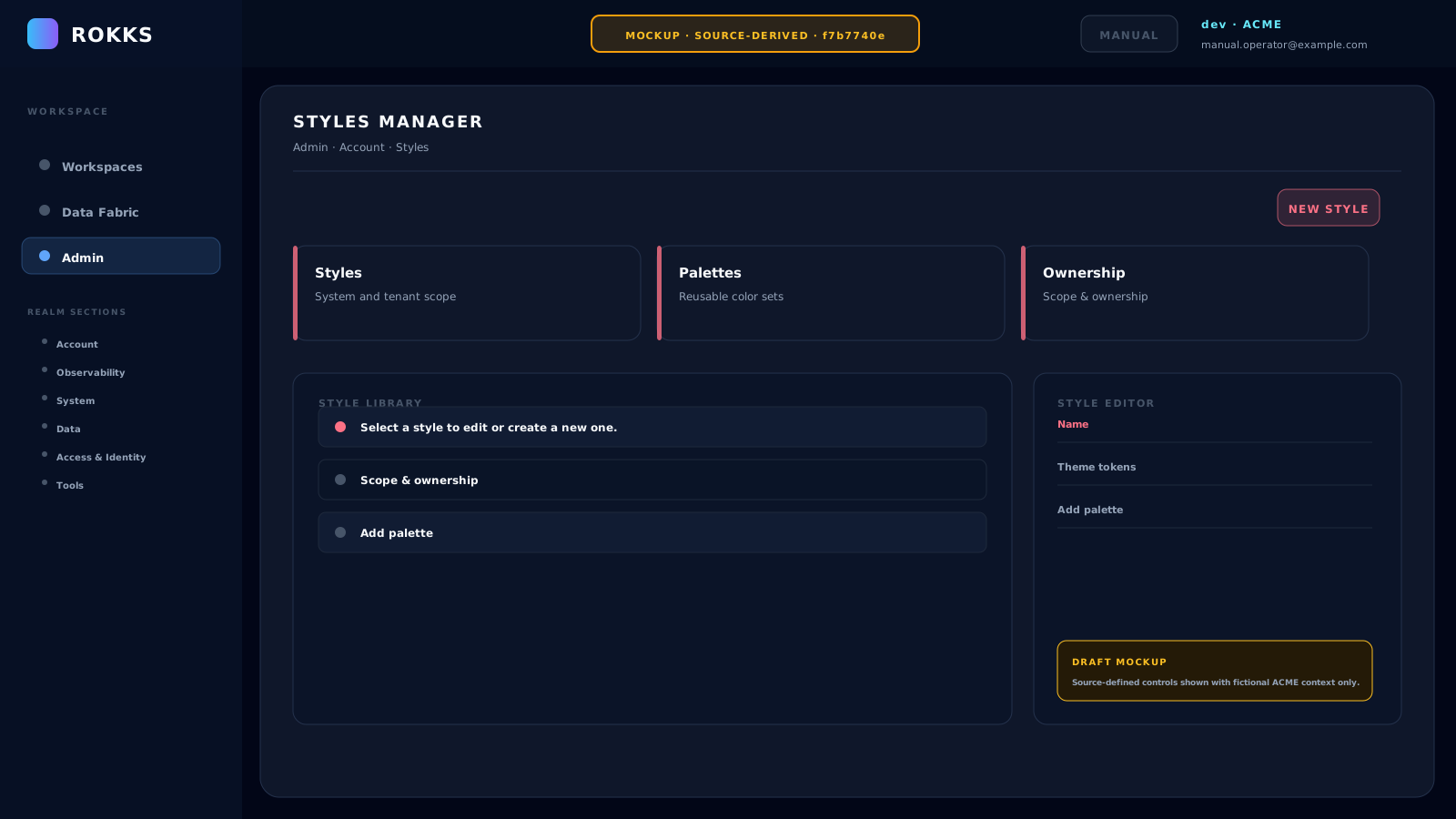
MOCKUPSource-derived illustration — not a captured product state
Step-by-step
Section titled “Step-by-step”- Open Styles.
- Review the active style configuration.
- Adjust approved visual options.
- Expand the built-in Preview section and check its synthetic sample widgets.
- Choose Create Style or Save Changes only after confirming contrast and readability in that preview.
- Open representative real dashboards after saving to verify the applied style with actual content.
Common mistakes
Section titled “Common mistakes”Do not use color alone to encode a business scenario. Labels, form, and layout matter for accessibility.
Do not make every widget colorful. A restrained visual language helps users notice real exceptions.